Redesigning a government agency brand
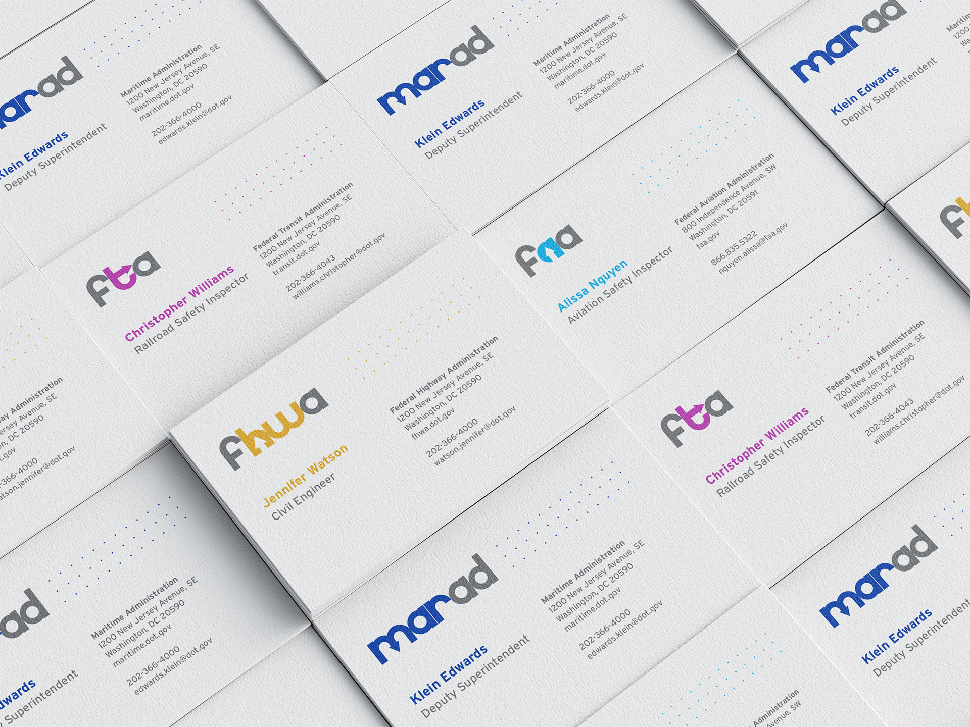
The United States Department of Transportation is the federal government’s lead agency for planning and support of the nation’s land, air and sea-based travel systems. The Department of Transportation consists of many sub-agencies, each with a different purpose and role. In this project, I chose five sub-agencies in addition to the main agency to redesign the branding for.
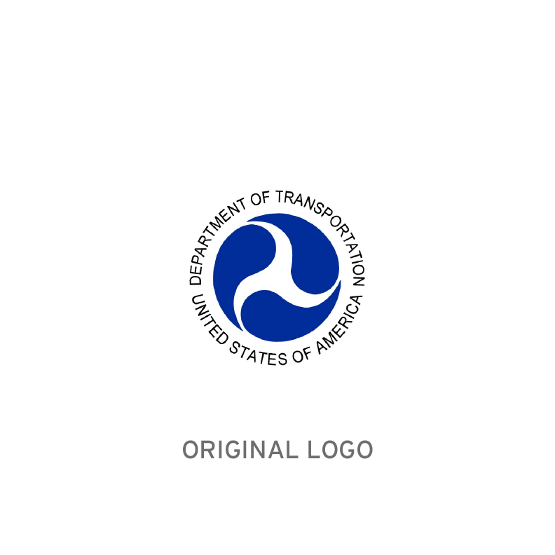
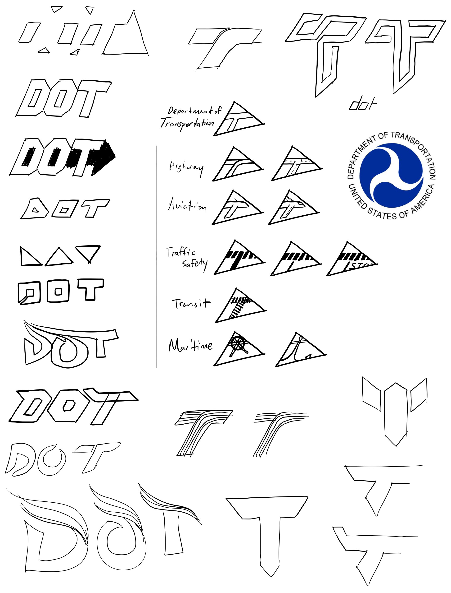
The original Department of Transportation logo is one of radial symmetry. It details a simplified triskelion that represents air, land, and sea, symbolizing the different modes of transportation the department oversees. The three identical blue droplet shapes that assemble the logo can be perceived as chasing each other and being in constant motion, representing the movement in transportation.
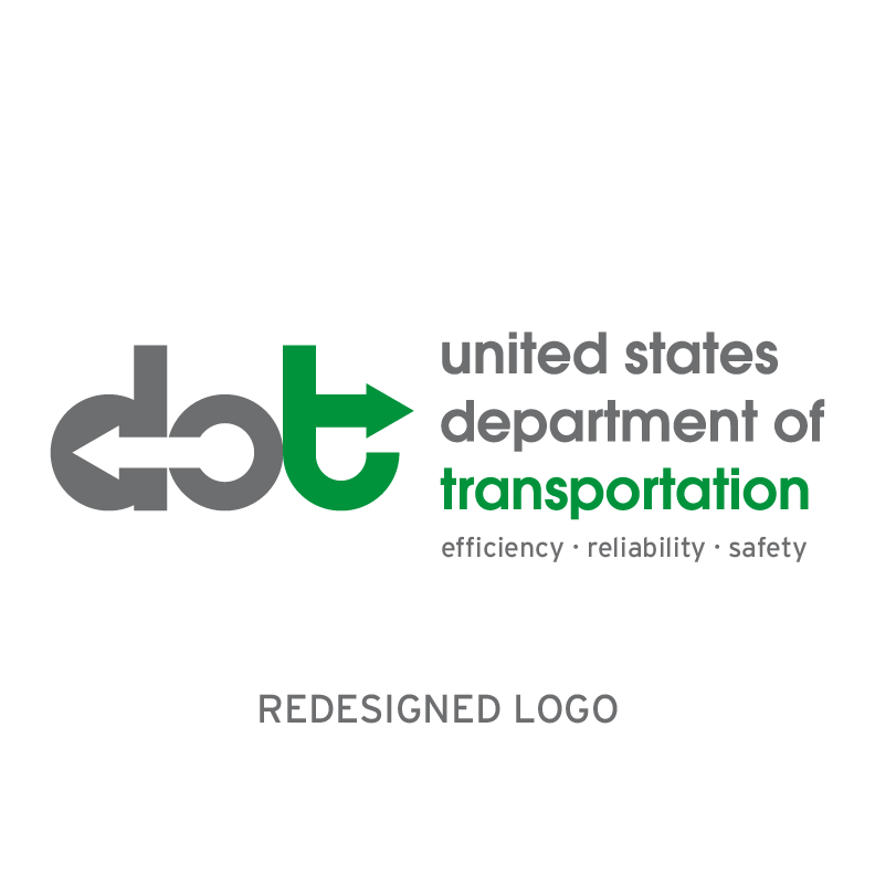
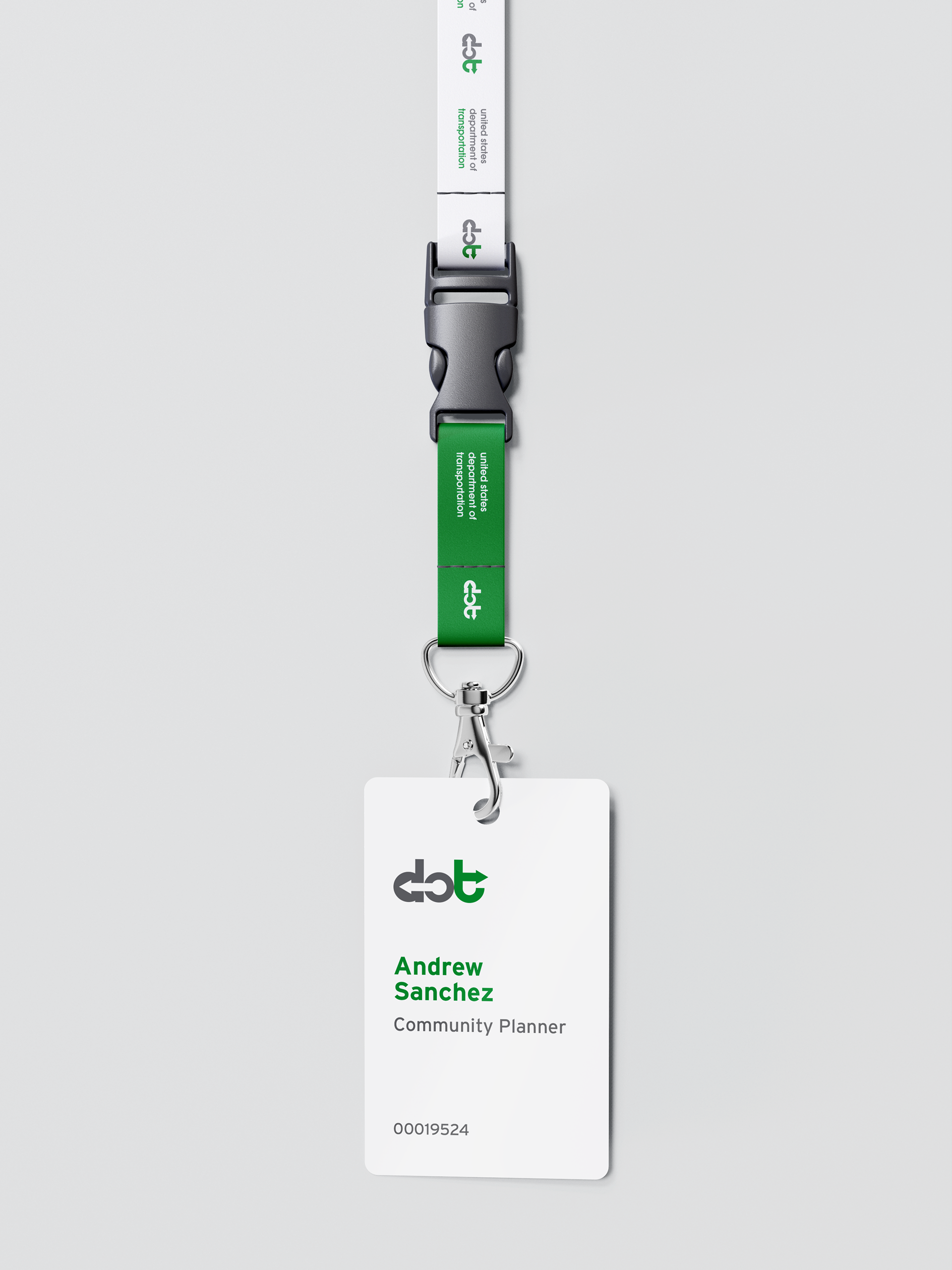
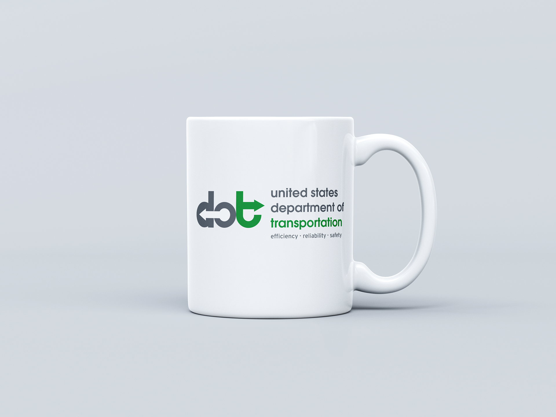
For the redesigned logo, I chose to focus on the key aspect of transportation: movement. To represent movement, arrows were established as the primary motif. I decided to include a slogan below the logotype of the main brand to represent the Department of Transportation's mission and carry it with the brand. This slogan is apparent only in the main brand.
Additionally, the logo of the main brand features two arrows of different directions that symbolize the agency's goal to extend the reach of transportation anywhere.
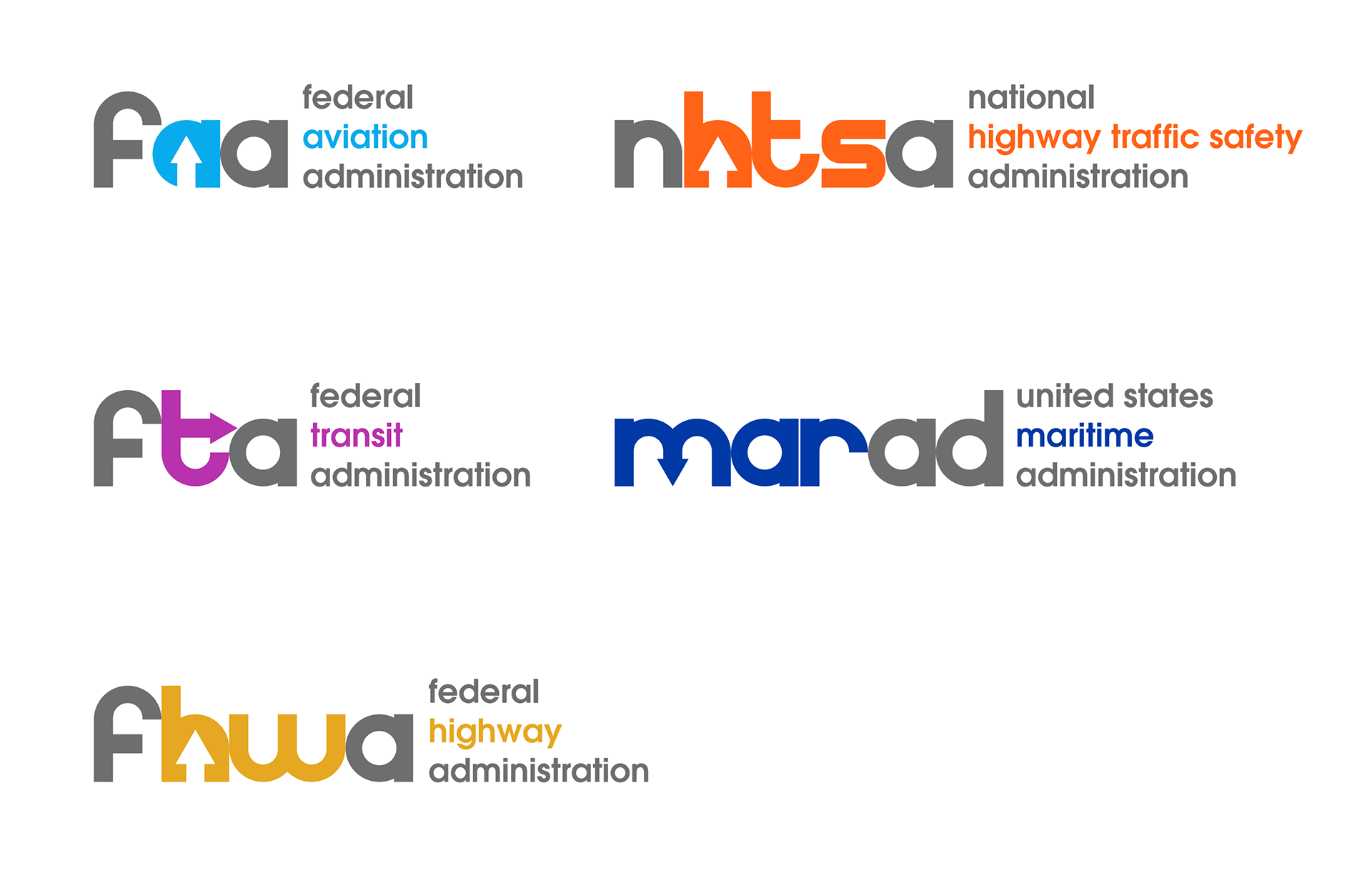
Uniting the sub-agencies with the brand
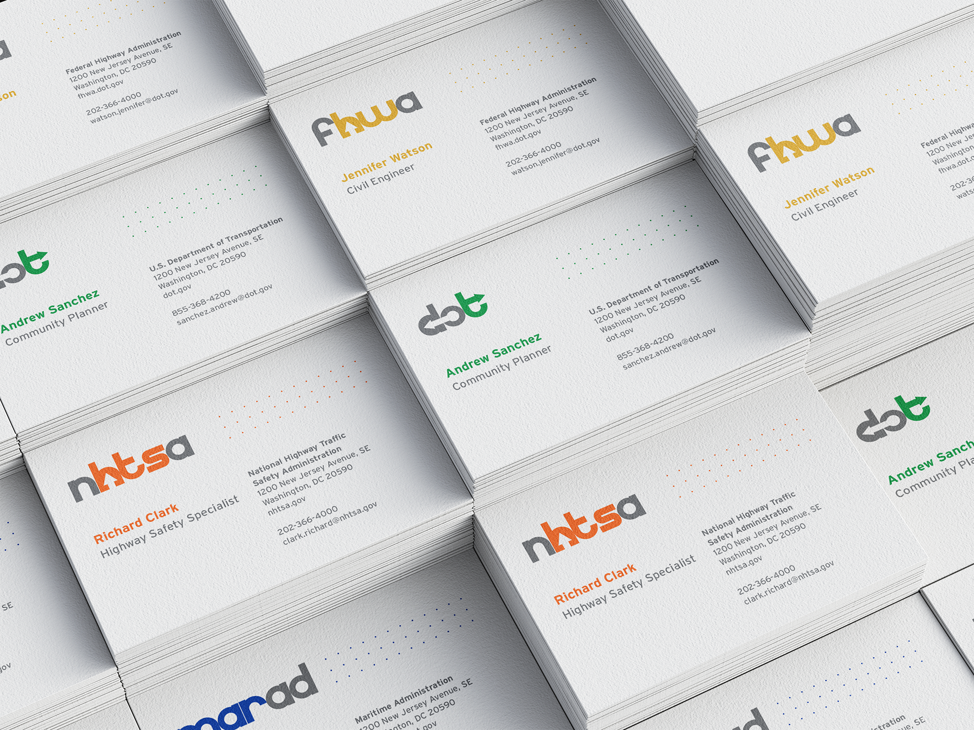
The original logo mostly represents the flow of transportation and the nature of movement, but lacks cohesiveness in a system with the sub-agencies. This logo redesign introduces a cohesive system among five sub-agencies under the main Department of Transportation by uniting them all through a consistent design language.
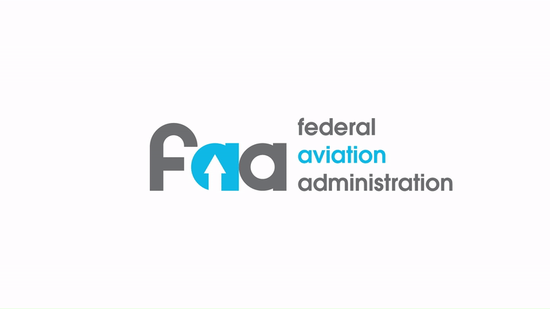
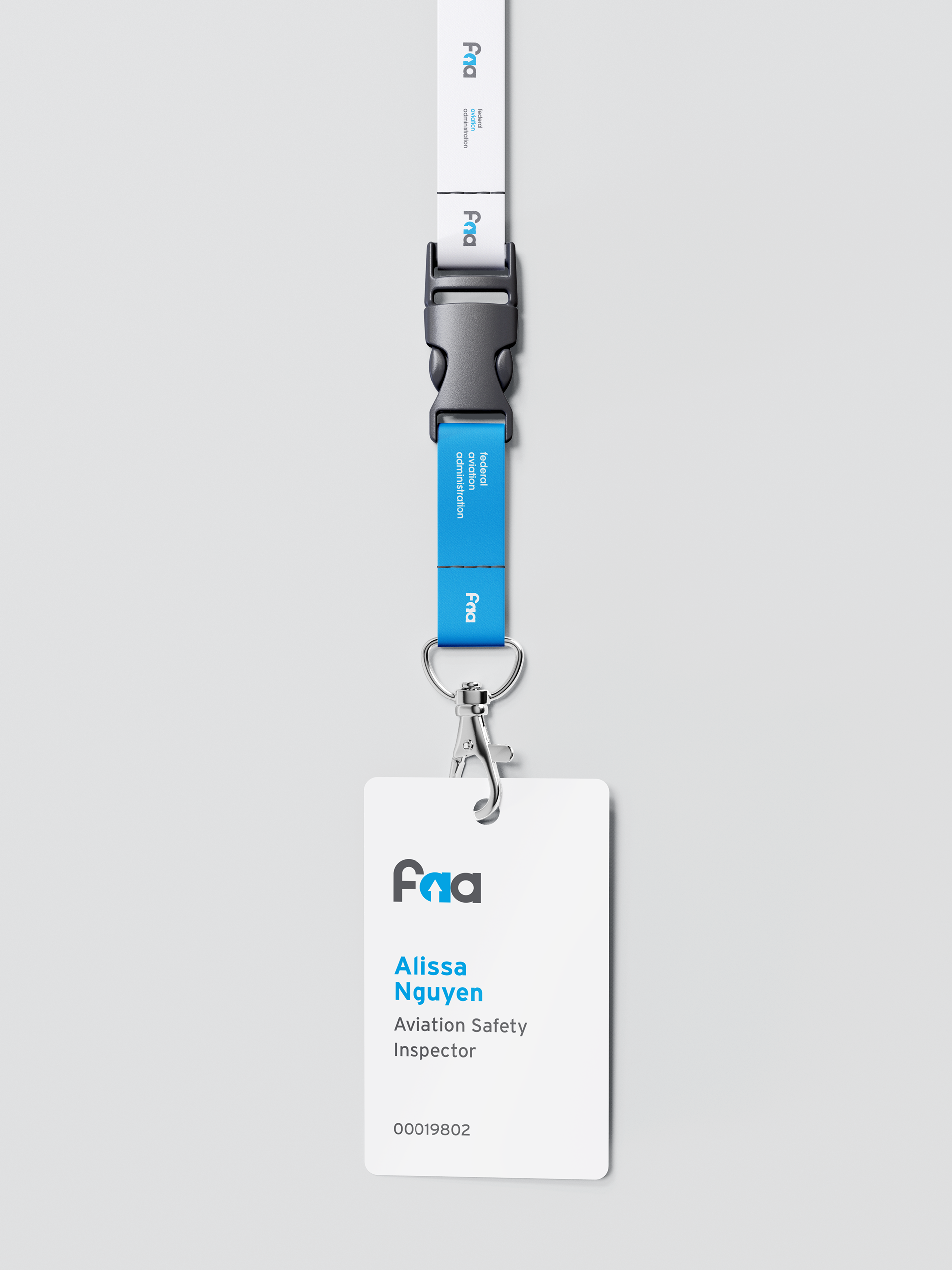
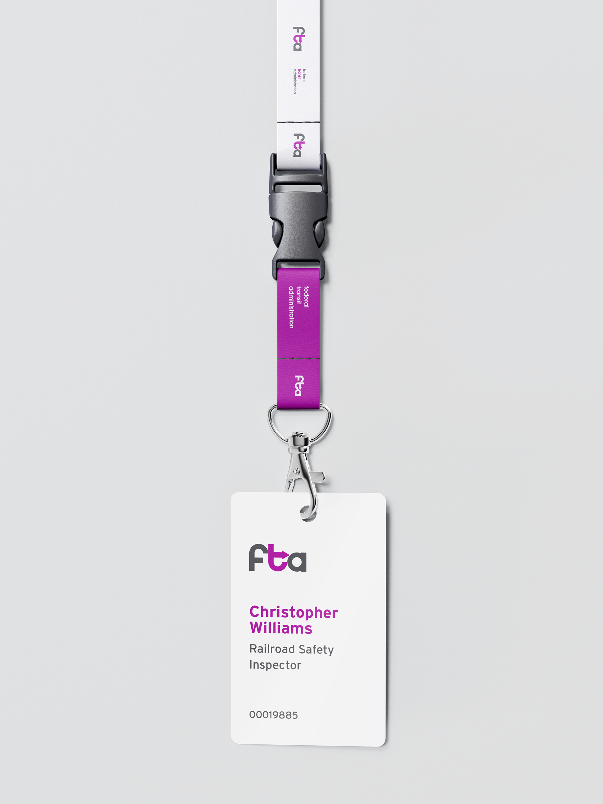
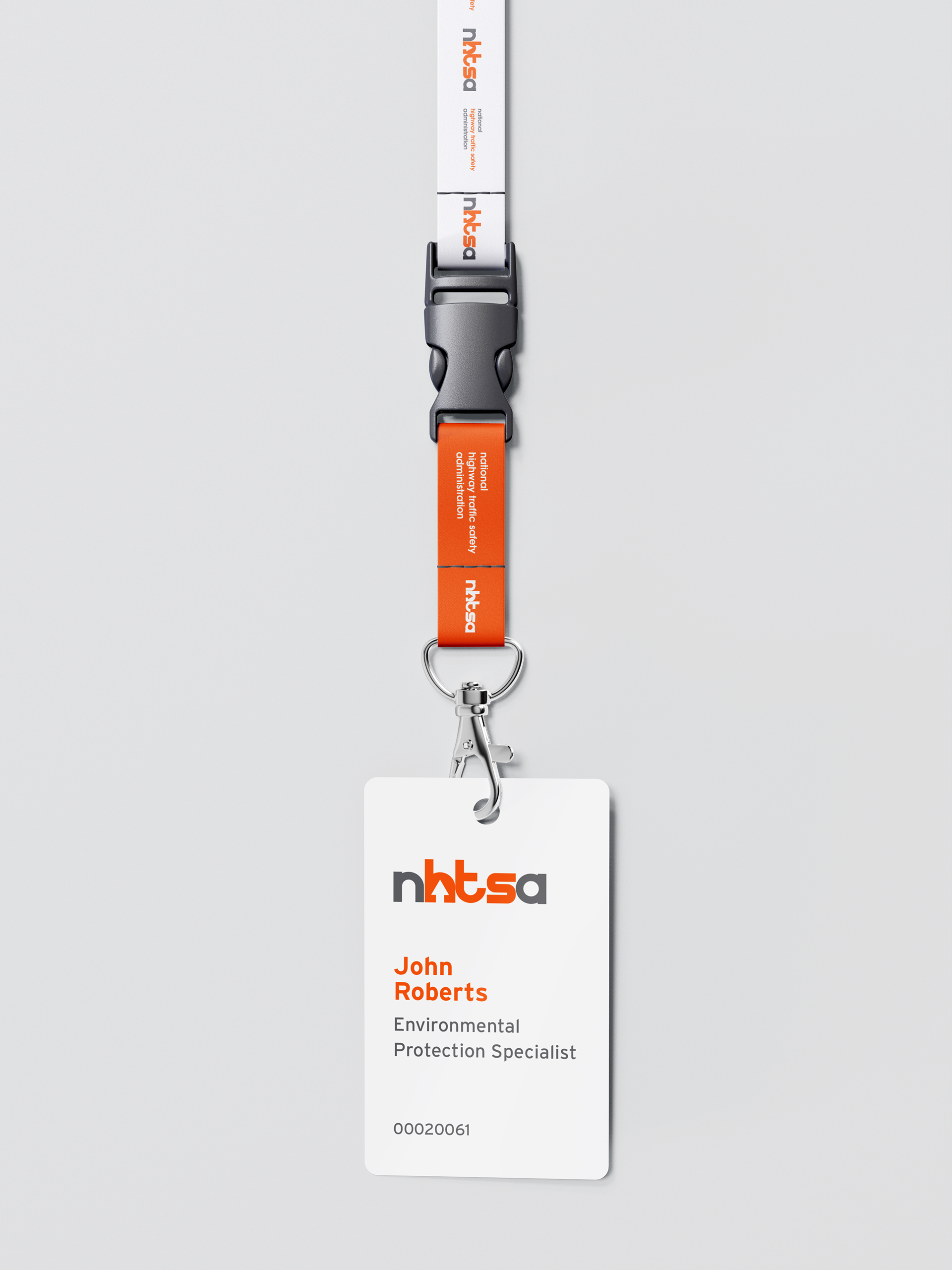
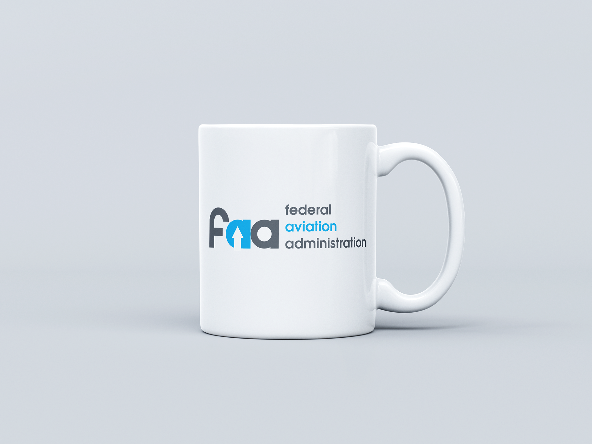
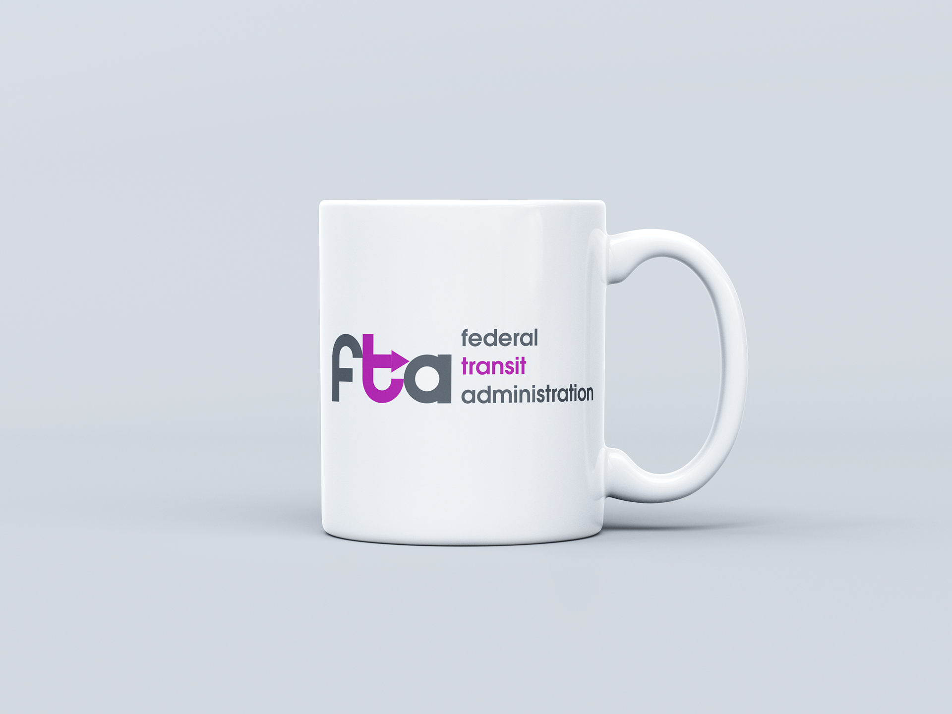
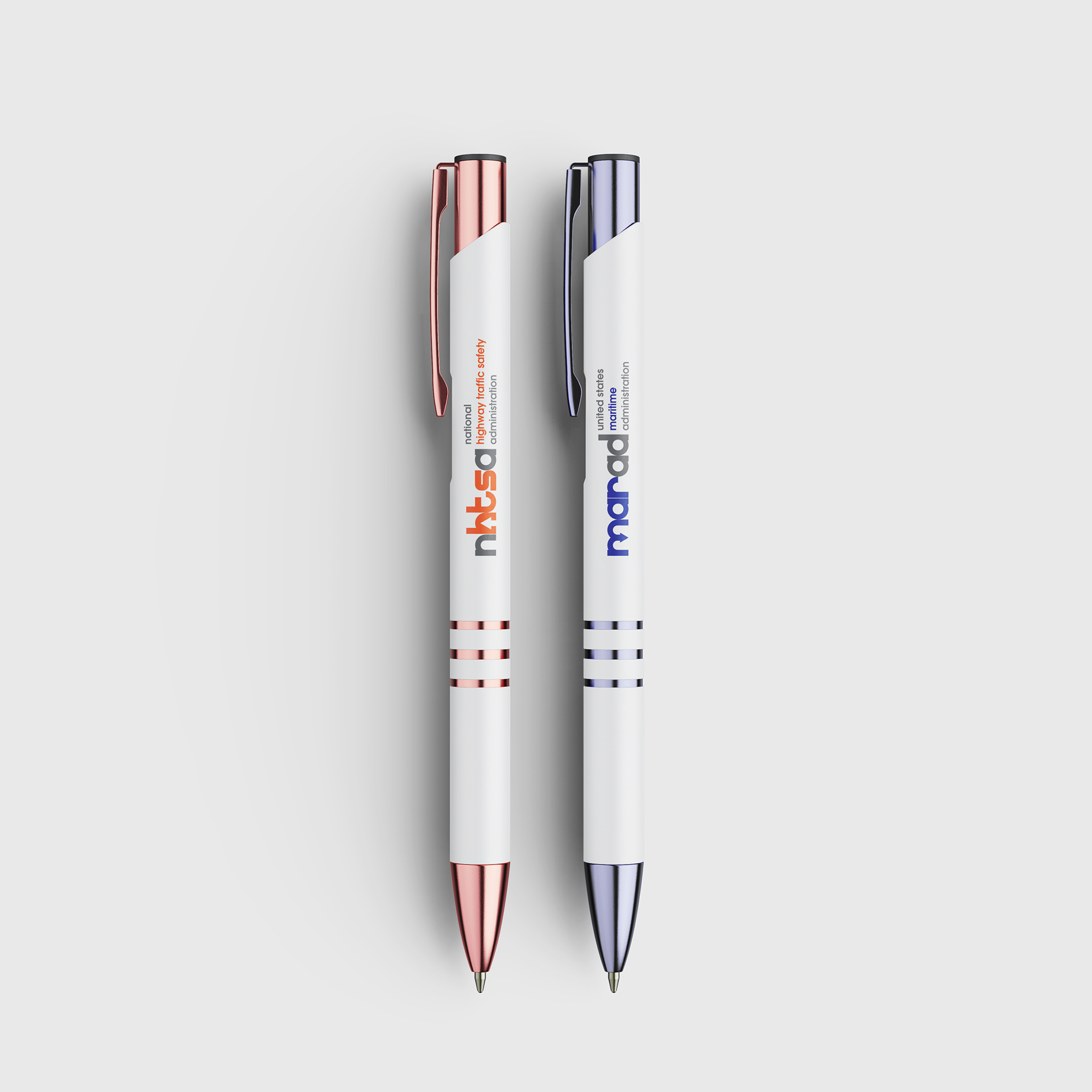
Each logo features an arrow pointing in the direction that relate to the respective sub-agency. For example, the Maritime Administration logo features a downward arrow to represent the sea while the Federal Aviation Administration logo features an upward arrow to represent the sky.
Design exploration
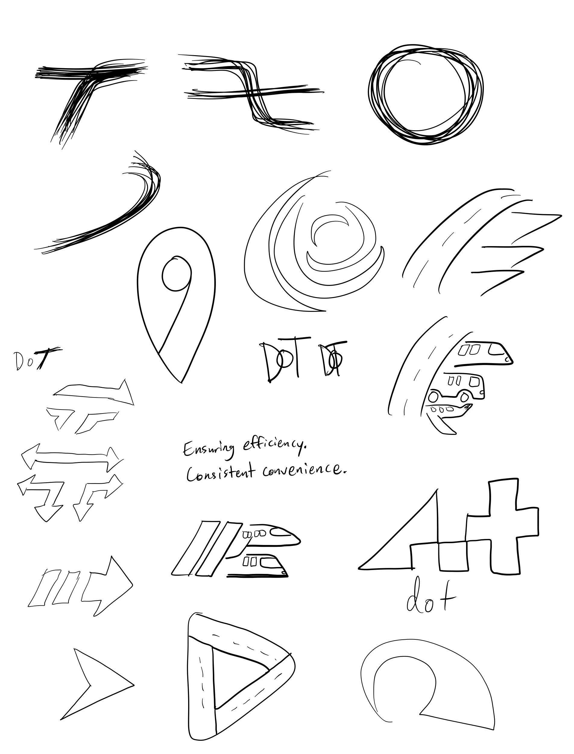
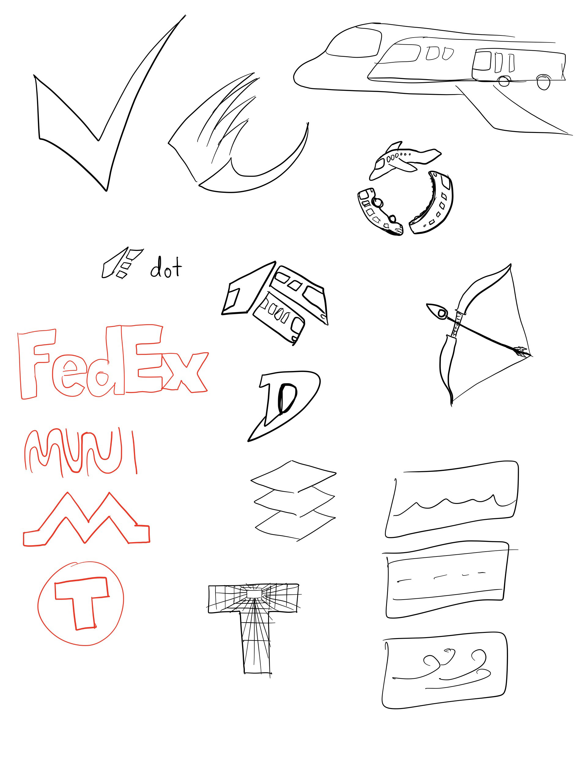
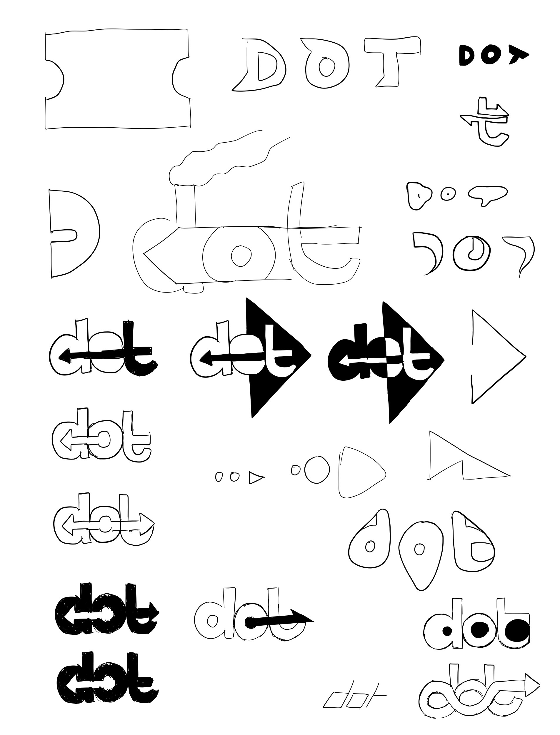
One of the core values of transportation I considered during the brainstorming stage was that you could "go anywhere" or "there is no place you cannot reach." This idea shaped how I approached the design of the brand and I brainstormed based on it.
The main challenge I faced while brainstorming was how to incorporate that idea with the concept of movement in a cohesive series of logos under the same master brand. A few initial design ideas I considered included the usage of loops, simplified roads, abstract vehicles, and stylized lettering. These were my initial attempts of trying to design the brand based on the concept of movement or "going anywhere," but the challenge of incorporating both together still remained.

Design direction
Ultimately, the design direction that most closely resonated with those themes was the use of arrows jointly with stylized lettering. I found the arrow motif to strike the concept of movement most prominently as it does not need to be in motion to imply movement. The use of stylized lettering allowed for arrows to unite with the shape of the letters and the negative space cleanly, demonstrating the ability to "go anywhere."
Motion graphic
To further establish the theme of movement into the brand, I decided the best way to express that was through a motion graphic. The focus of the motion graphic was to visually bring all of the brands of the sub-agencies together with the main brand as one cohesive system. The motion graphic showcases various movements that symbolize each sub-agency.
Animated transitions
Each transition in the motion graphic between each logo employ animations appropriate to the resulting logo. For instance, the FAA logo suggests a bouncy or floaty entrance to correlate to its description of operating the aviation sector of the Department of Transportation. Another example would be the transition between the FAA and FTA logos animate a forward movement—similar to the forward movement of subway trains—and finishes with the individual letters of the logotype clumsily get into position, much like a visual impression of a timelapse in a busy transit area.

Credit: https://gifer.com/en/yT
Brand gallery

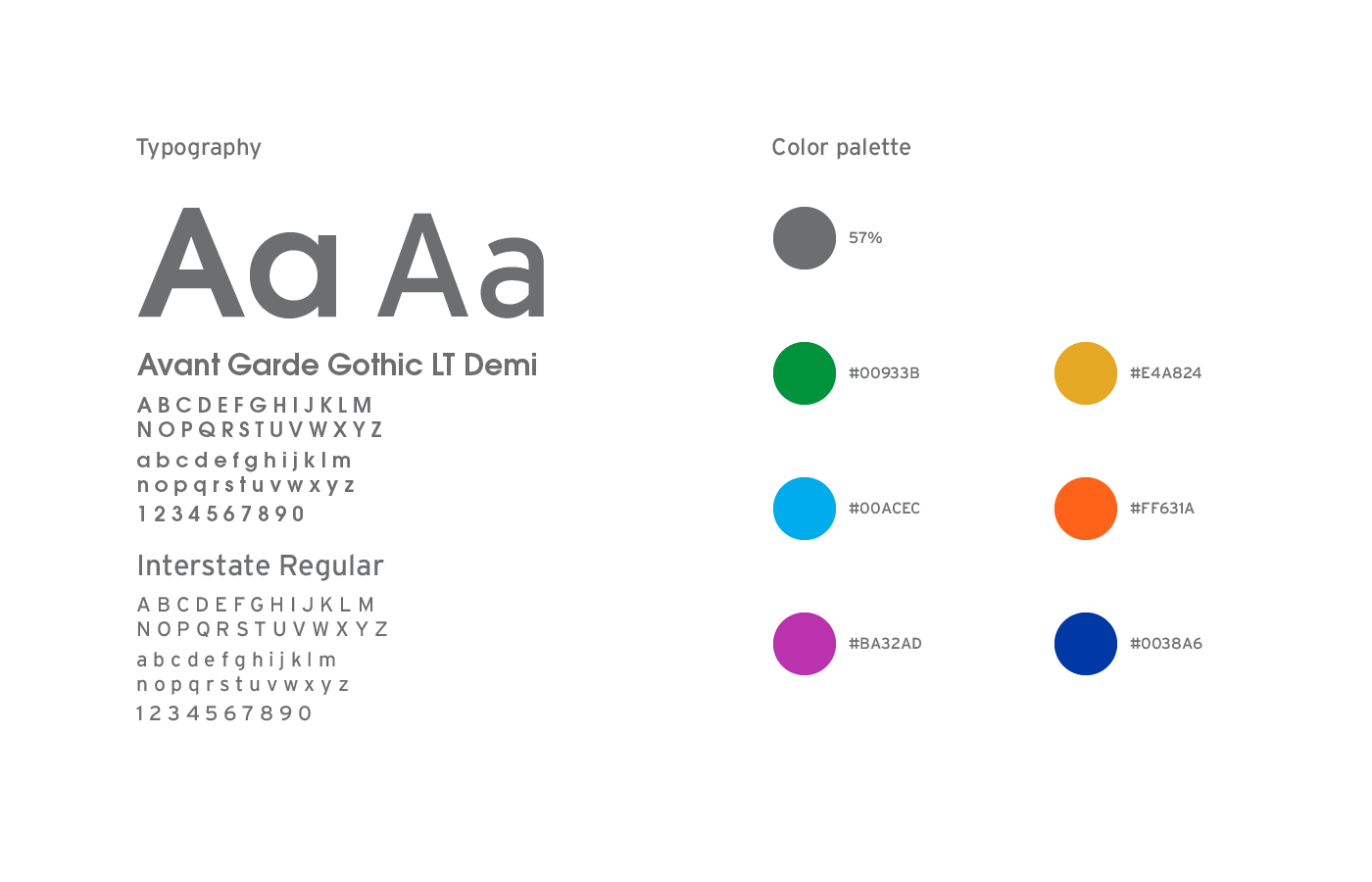
Style guide
The color chosen for the main brand express what it is about: efficiency, reliability, and safety. The colors chosen for the sub-agencies express the description of each one: air travel, transit, highway, safety, and maritime.
The typefaces chosen aims to signify an evolution to which the government agency values: "To deliver the world’s leading transportation system." Avant Garde Gothic represents a genre of art known as avant-garde and depicts introducing experimental and unusual ideas. Interstate, which is used on highway signs, is known for high readability from a distance or at a quick glance.