An interactive timeline
The history of graphics in video games dates back to the first video game ever created, the 1958 game "Tennis for Two," which featured moving graphics on an oscilloscope. This project aims to visualize the history of video game graphics in the form of an interactive timeline, starting with the popular Atari game "Pong" in 1972.
Video game graphics are computer-generated and can be as simple as clusters of vector lines. The more complex graphics in video games included the use of 3D models, which consist of many polygons ranging from hundreds to upwards of six-digit amounts. In relation, this interactive timeline features the use of many polygons of incidental shapes and sizes.
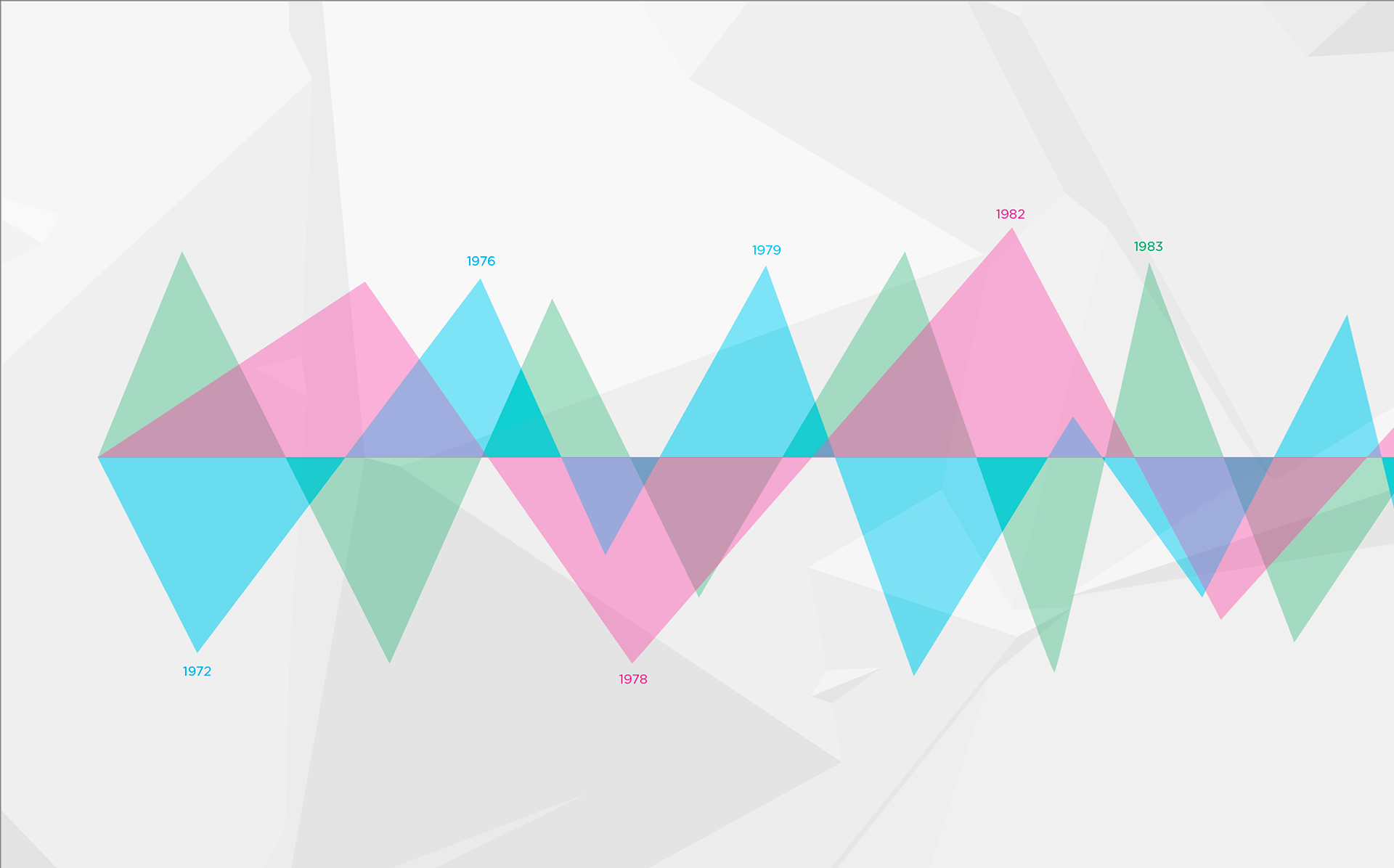
This interactive timeline categorizes video games by the colors magenta, cyan, and green based on the style of graphics they feature. Firstly, games that feature stylized graphics (cartoon-like) are highlighted in magenta. Secondly, games that feature abstract graphics (eg. polygons, 2D, vector) are highlighted in cyan. Lastly, games that feature photorealistic graphics are highlighted in green.
Interactions and user feedback
The History of Video Game Graphics interactive timeline features many interactive elements. All interactive elements respond with animations, creating a highly responsive experience.
Signifiers, such as a rotating button when clicked or sliding images and text, show the user that their action had taken place and responded to. For example, when the Learn More button is clicked, the button rotates and additional information slides into view.
When inspecting an event from the timeline, the master timeline becomes part of the background that shows the user's current position on the timeline. This is one feature intended to help the user remember where they are on the timeline and makes navigating around the timeline easier.
Navigation and visual cues
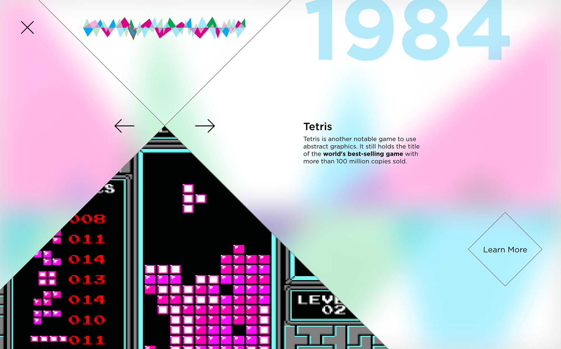
The primary method of navigation when inspecting events within the interactive timeline revolves around the central cross-section. The back and forward buttons can be found at the intersecting area, while the timeline navigator and the exit button can be found above.
In addition to the master timeline in the background reminding the user of their current position, the timeline navigator also reminds the user their current position on the timeline by highlighting the currently inspected event. This highlight will animate and move towards the event chosen by the user. The master timeline in the background and the year at the top right will also animate and move in the direction of the next chosen event.
Design process
When approaching the design of an interactive timeline, one key challenge to consider is how to include and categorize different types of events on a something as linear as a timeline of history. Since the first video game, graphics have evolved in numerous ways to meet the artistic goals of various video games and distinct graphical styles have been established as a result.
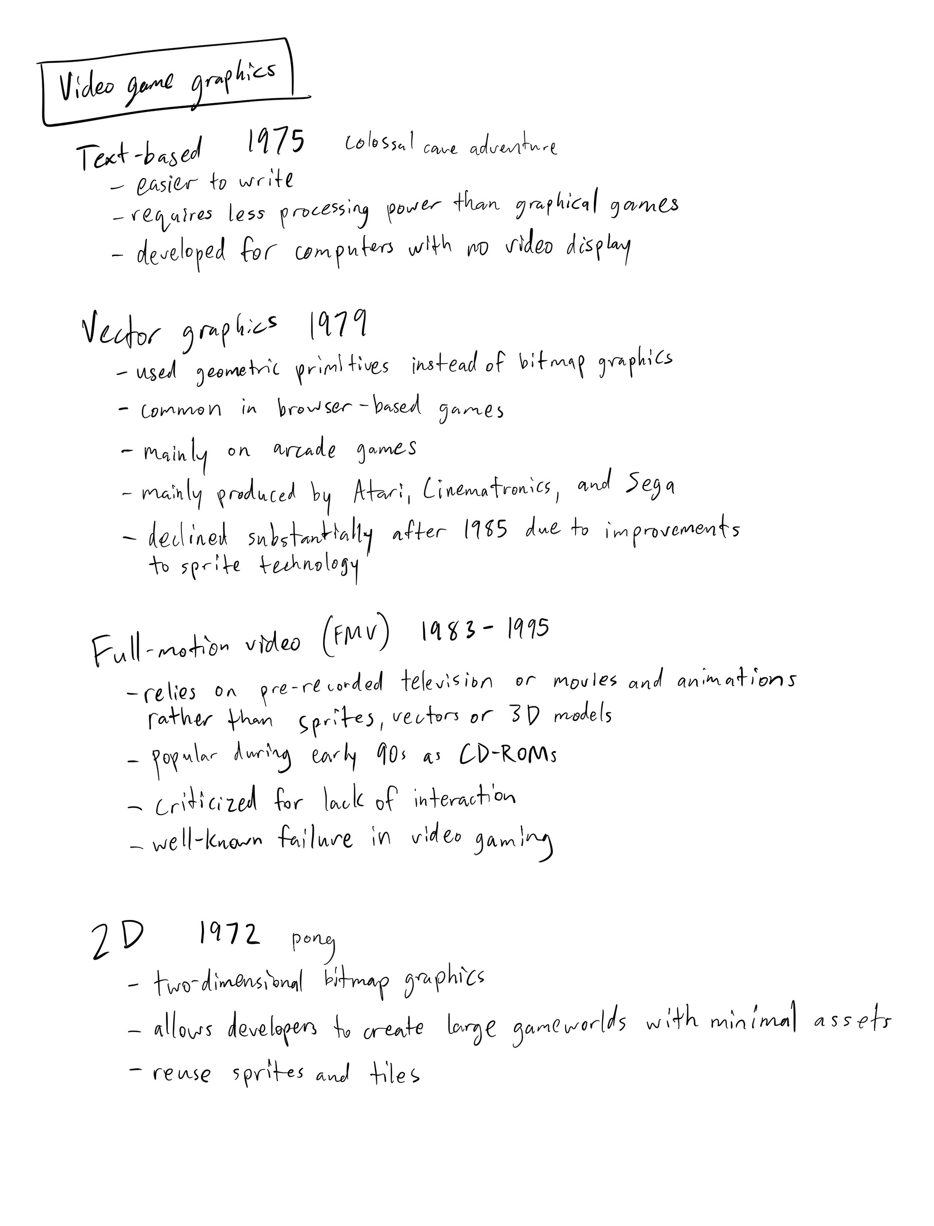

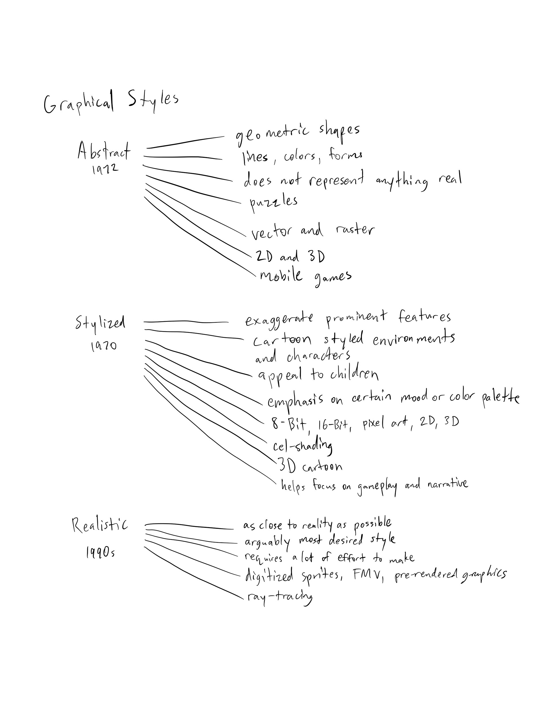
These distinct graphical styles were narrowed down and visually designated into three categories for the interactive timeline: stylized (magenta), abstract (cyan), and photorealistic (green). Categorizing three styles of video game graphics created a strong contrast between the timeline events. This resulted in a visually engaging aesthetic of a timeline outfitted with many polygons.

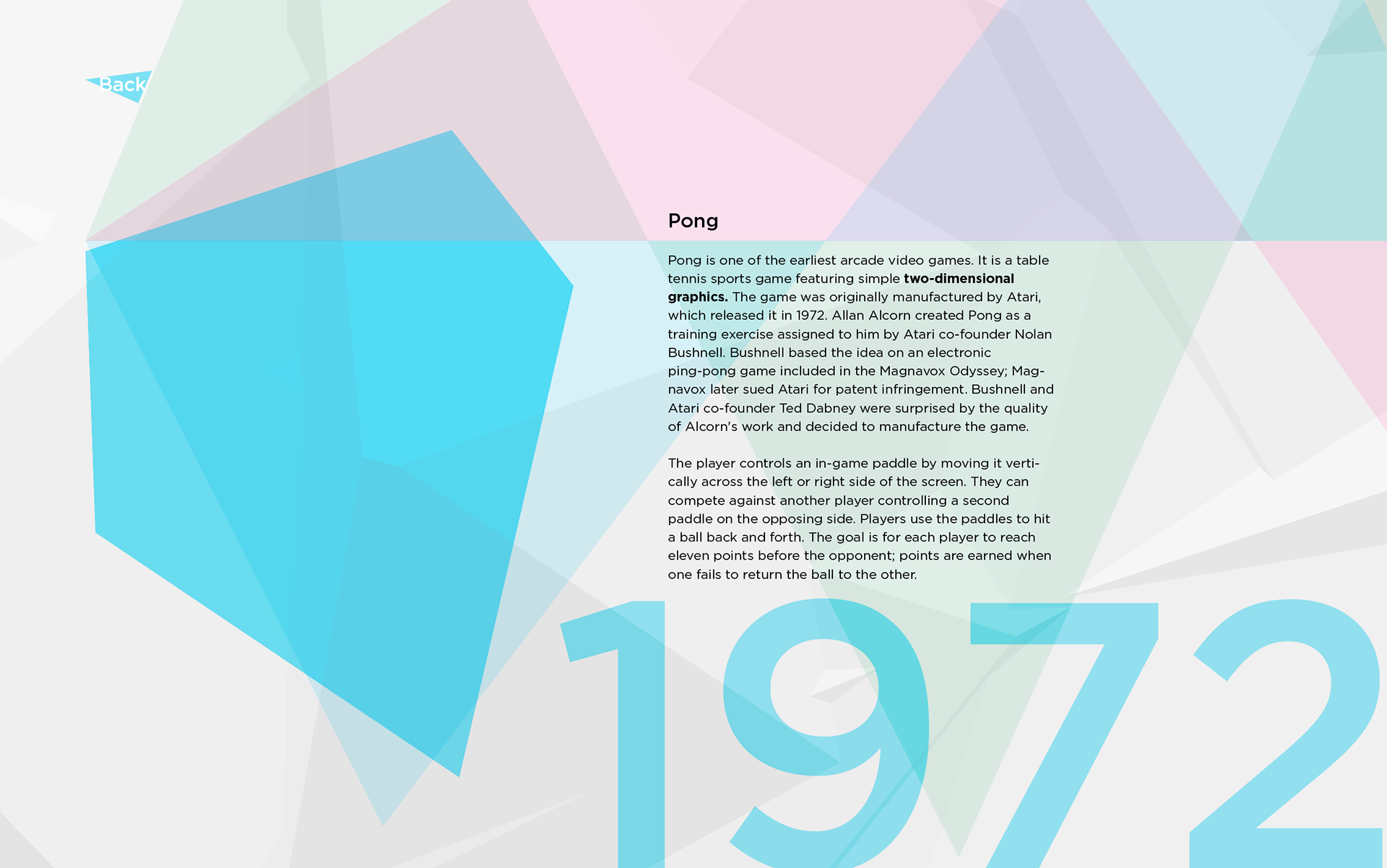
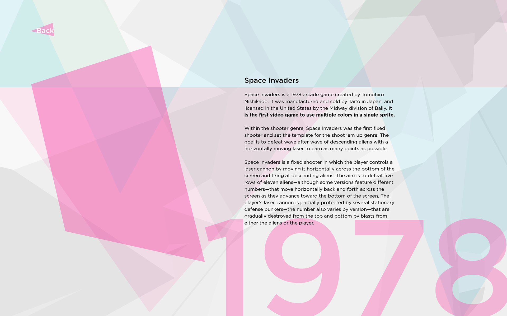
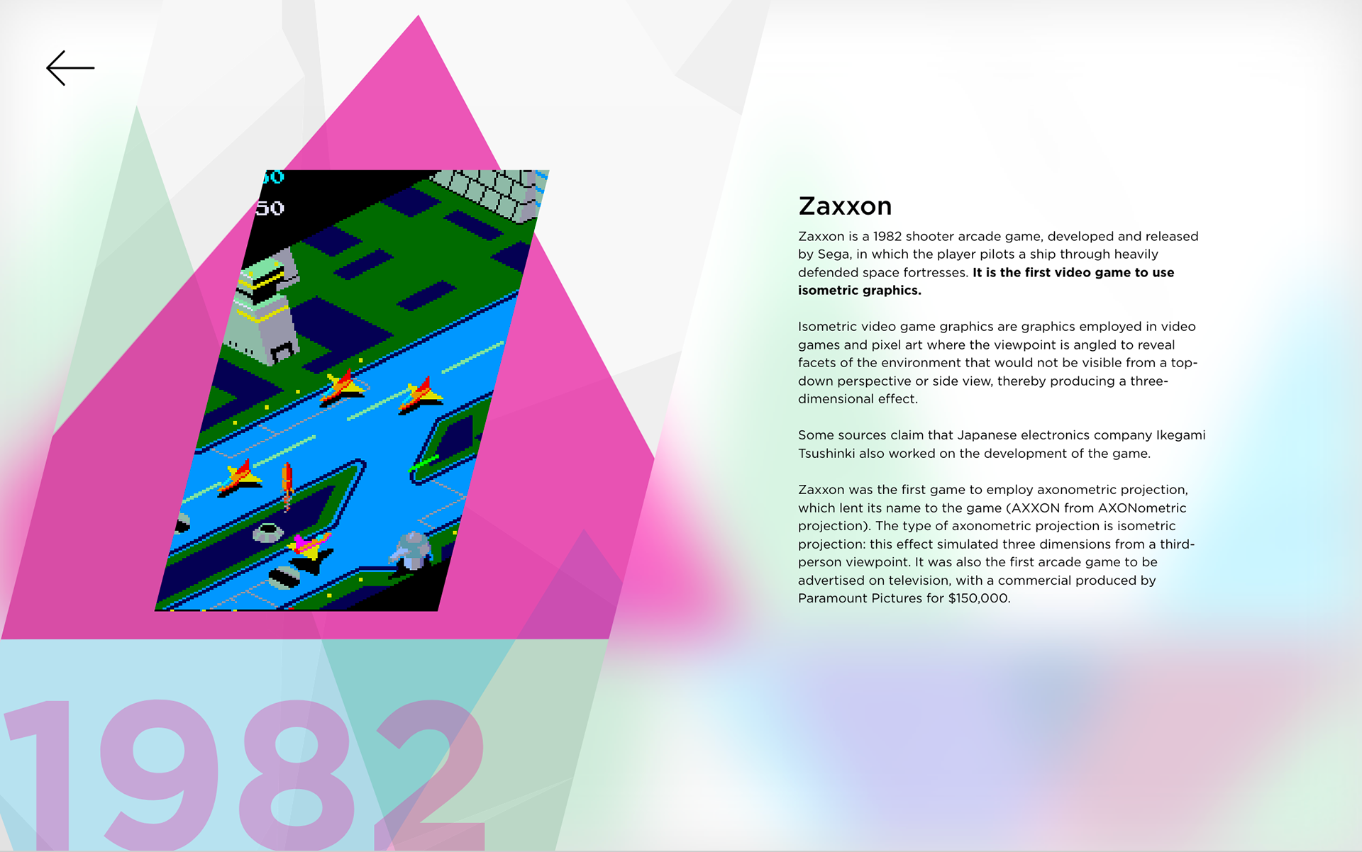
The second level of interaction (inspecting a timeline event) includes four key elements: the title of the video game, a description explaining the graphics and style used in the video game, an image of the video game, and the year in which the video game released.
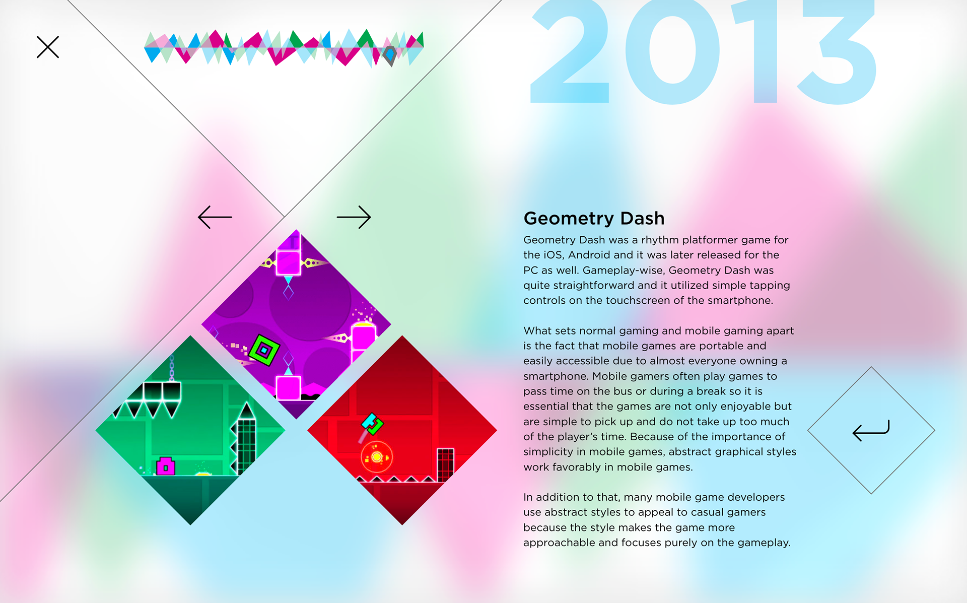
Early iterations of the second level of interaction left room for one large image, a wall of text, and the year displayed large. This led to the inclusion of a third level of interaction: the Learn More button, which displays additional images and information when clicked.
In order for navigation to remain without compromise, the third level of interaction was made to allow the same degree of navigation as the second level. Later iterations introduced a central cross-section navigation cluster and consistency became the grand objective in to allow for a smoother user flow. This resulted in images bearing the same shapes and interactive elements being placed in the same position across all timeline events.
Style guide
The colors chosen for the interactive timeline represent the colors produced by individual pixels on a digital display: the RGB color model. Red, green, and blue are the primary colors that fabricate any image seen from a video game. The interactive timeline depicts these representations as magenta, cyan, and green.
Gotham was chosen for display text as well as body text to allow for high readability and legibility as the timeline was designed for interaction on devices equipped with digital displays.
Try the prototype!
The History of Video Game Graphics interactive timeline is available as a prototype below.
