To inform, not provoke
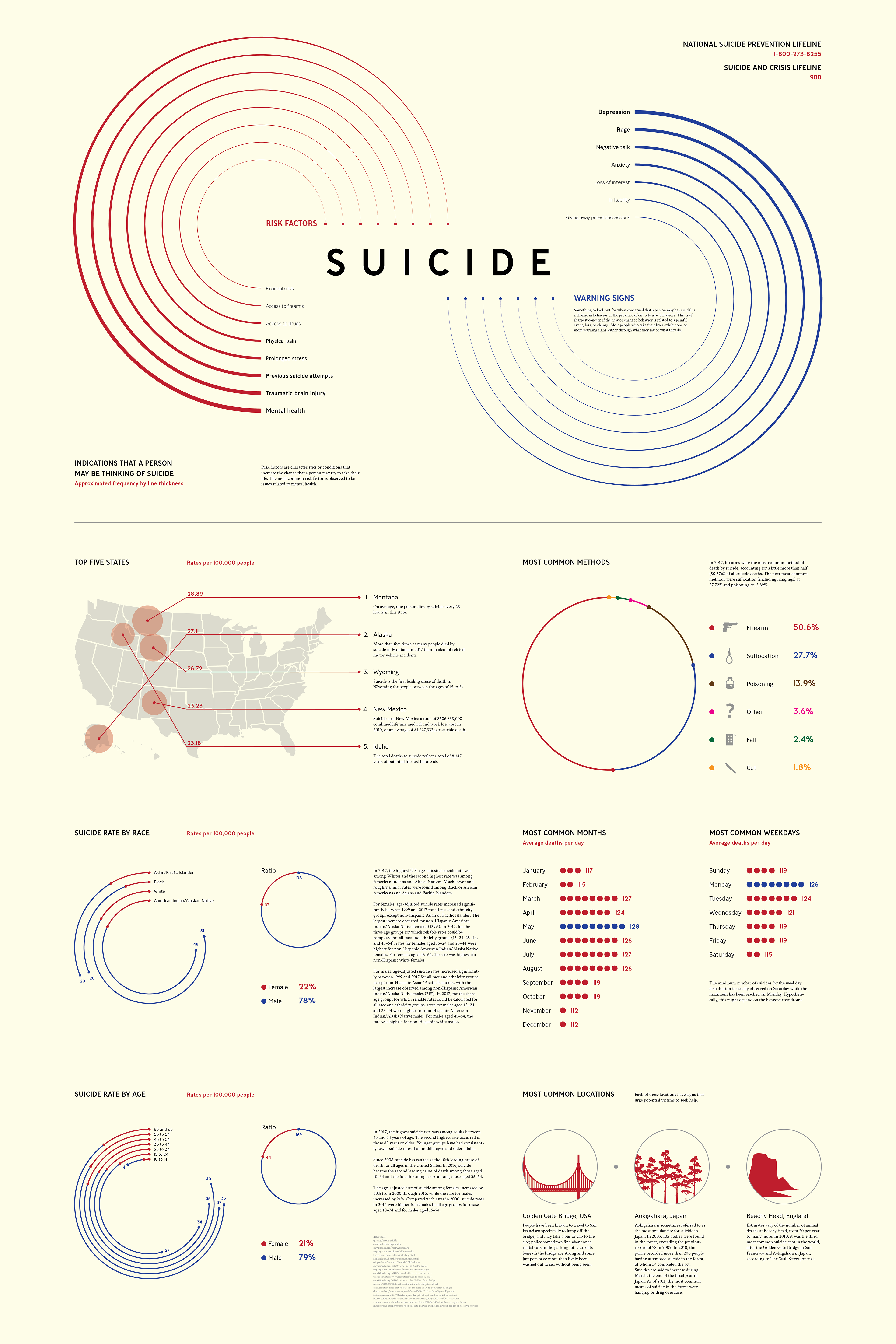
With the intention to raise awareness about a serious topic, the purpose of this infographic is to inform, not provoke the viewer. This is an infographic containing various facts and statistics involving suicide, including leading risk factors and warning signs, most common suicide method, and suicide rates per certain demographics. Statistics are based on data from 2017 to 2019.
Full infographic
Neutral background color
To maintain a neutral tone throughout the infographic, the color I chose for the background is an off-white color with a yellow tint. For one such sensitive topic like suicide, this aims to put the viewer's mind at ease when reading the infographic.
Other colors I considered for the background were pure white or black. Ultimately, I decided against black or any shades of gray because I felt it would set a negative tone and incite feelings of sorrow and uneasiness for the viewer. A colorless pure white background would have a similar neutral tone as the off-white color I chose as pure white does not suggest any negative feelings, but I felt that it would represent emptiness, which would not be a positive or neutral tone for this particular topic. A feeling of emptiness could mean a feeling of lifelessness.
The yellow-tinted off-white color I decided to use has a good balance of maintaining a neutral tone and easing the mind of viewers. With this background color, I hoped to put more focus on the statistics presented without negatively influencing the emotions of viewers.
Infinity
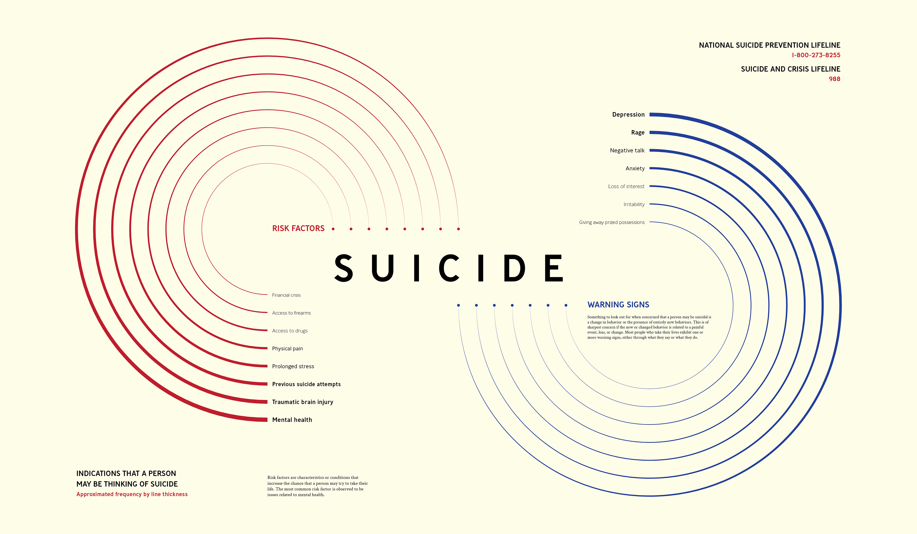
The first section of the infographic features a chart presenting estimated data about indications that a person may be thinking of suicide, separated into two categories: risk factors and warning signs. Visually, the chart implies an abstract infinity symbol, representing a "cycle" of life and death wherein the troubles victims deal with lead to suicide.
Risk factors are characteristics or conditions that may lead a person to consider suicide. Warning signs are signifiers, such as change in behavior or noticeable implications, that may lead a person to consider suicide.
The data on this infinity chart, while estimates, are ordered based on the frequency of occurrences. The frequency of occurrences were compiled based on how often the sources listed them. As these types of statistics involve what suicide victims experience, such studies have been hypotheses rather than exact numbers of occurrences. Data involving leading suicide victims to suicide remain difficult to gather.
Design language
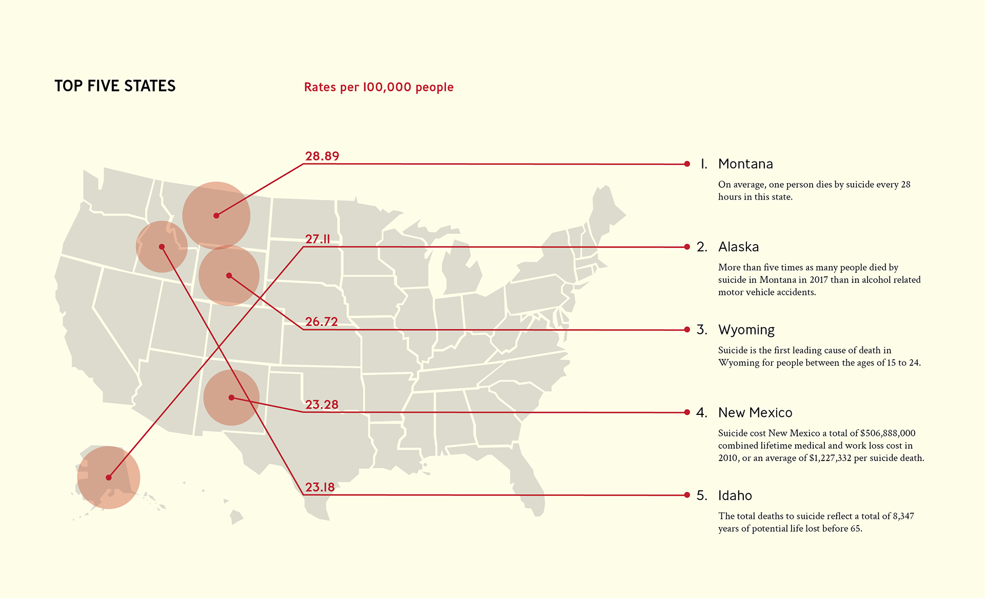
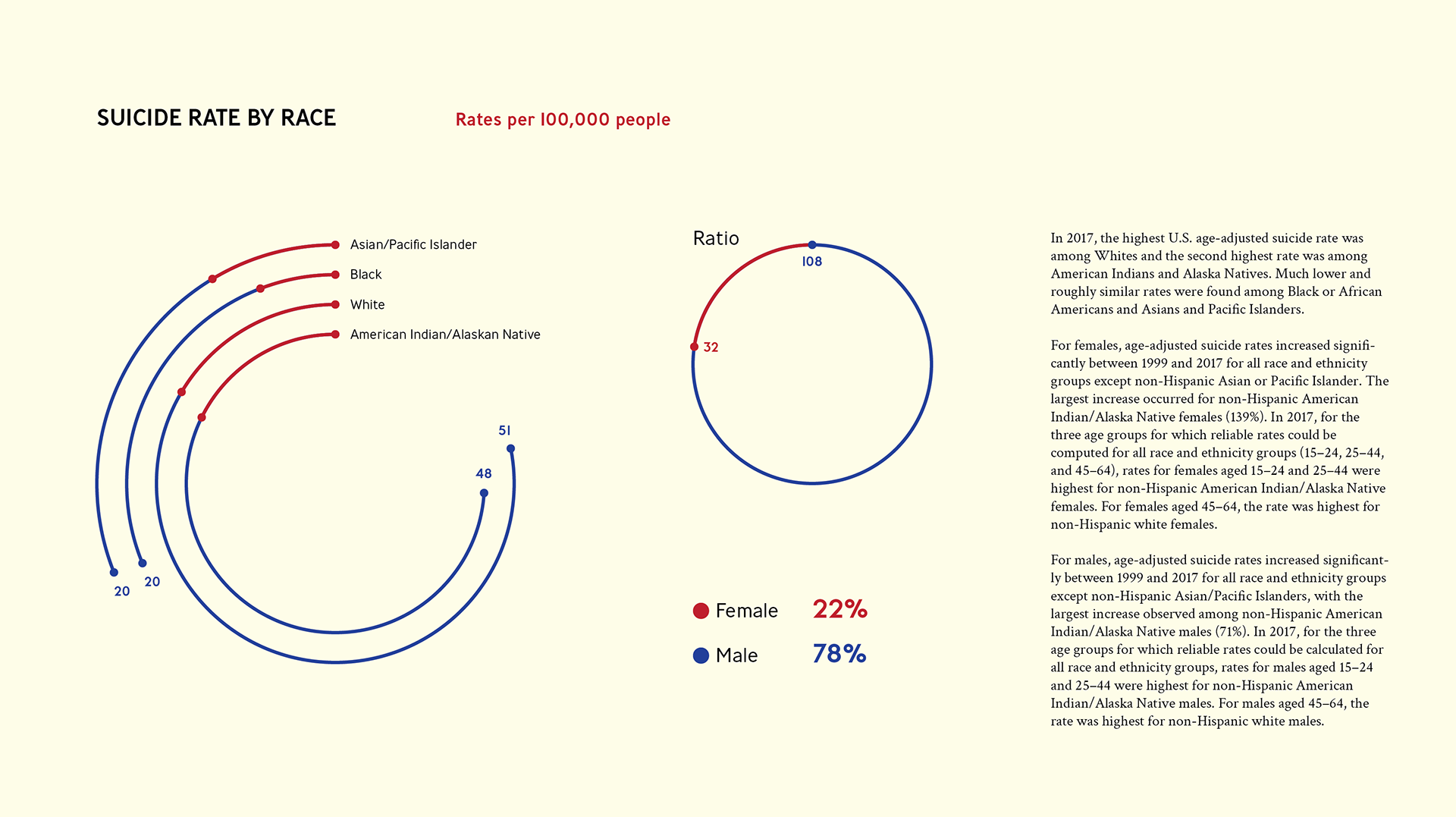
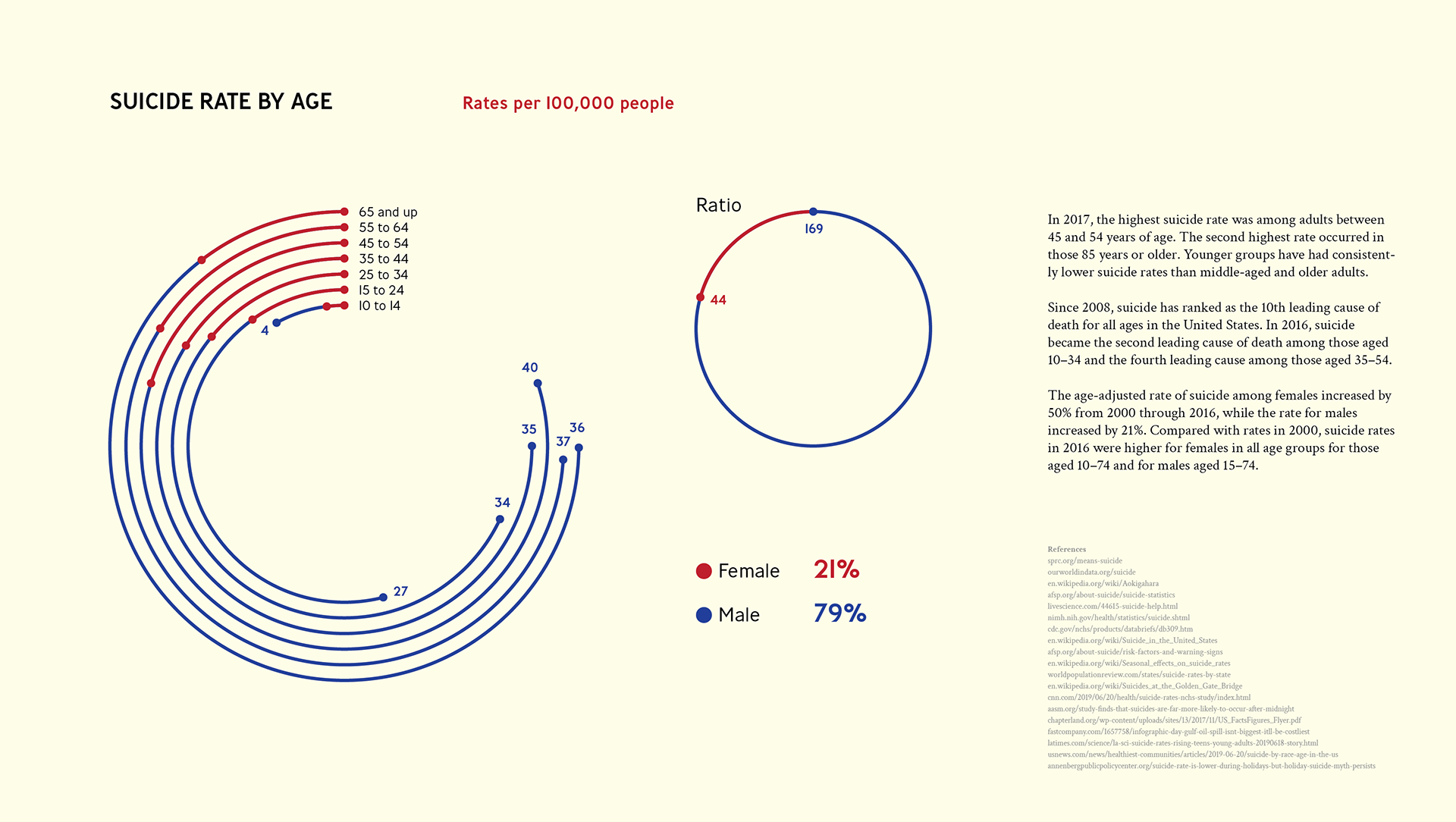
This infographic features a strong use of circles. Graphs utilize circular forms in various ways to visualize data, such as the radial graphs for suicide rates by demographic. Charts like the most common risk factors and warning signs use size and weight to represent how common each of them are.The reason I chose to use circular shapes is that they do not have any sides or edges. Shapes with sharp edges could represent the feeling of danger. I decided circles were the best shape to use because it lacks sides and edges and can suggest a neutral expression in any form.
Color choices
The primary color I used to visualize data on the infographic is a dark red. Dark red is a color often associated with rage and anger, which can relate to the topic of suicide as these are emotions that suicide victims likely harbored. However, dark red can also symbolize vigor, willpower, and courage. I chose dark red as the primary color because it has these traits on two sides of the same coin, to symbolize there is light at the end of the tunnel.
Accent colors include dark blue, gray, and black. The dark blue was intended to support the dark red color while not overpowering it. Dark blue evokes feelings of authority and importance, meaning all lives matter. Gray and black are used only for supporting imagery and text and do not have any emotional significance other than to remain neutral.
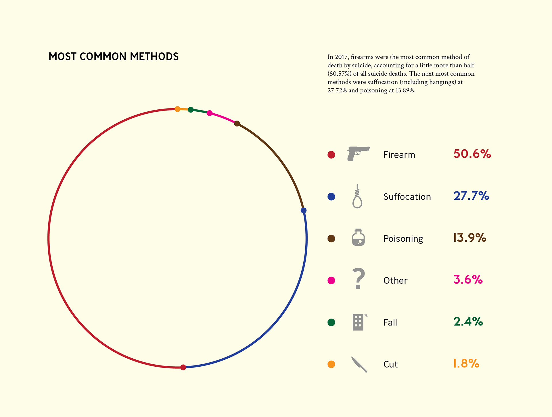
Additionally, various colors of similar saturation are used specifically for the "Most Common Methods" graph only. These colors were used only to differentiate the data.
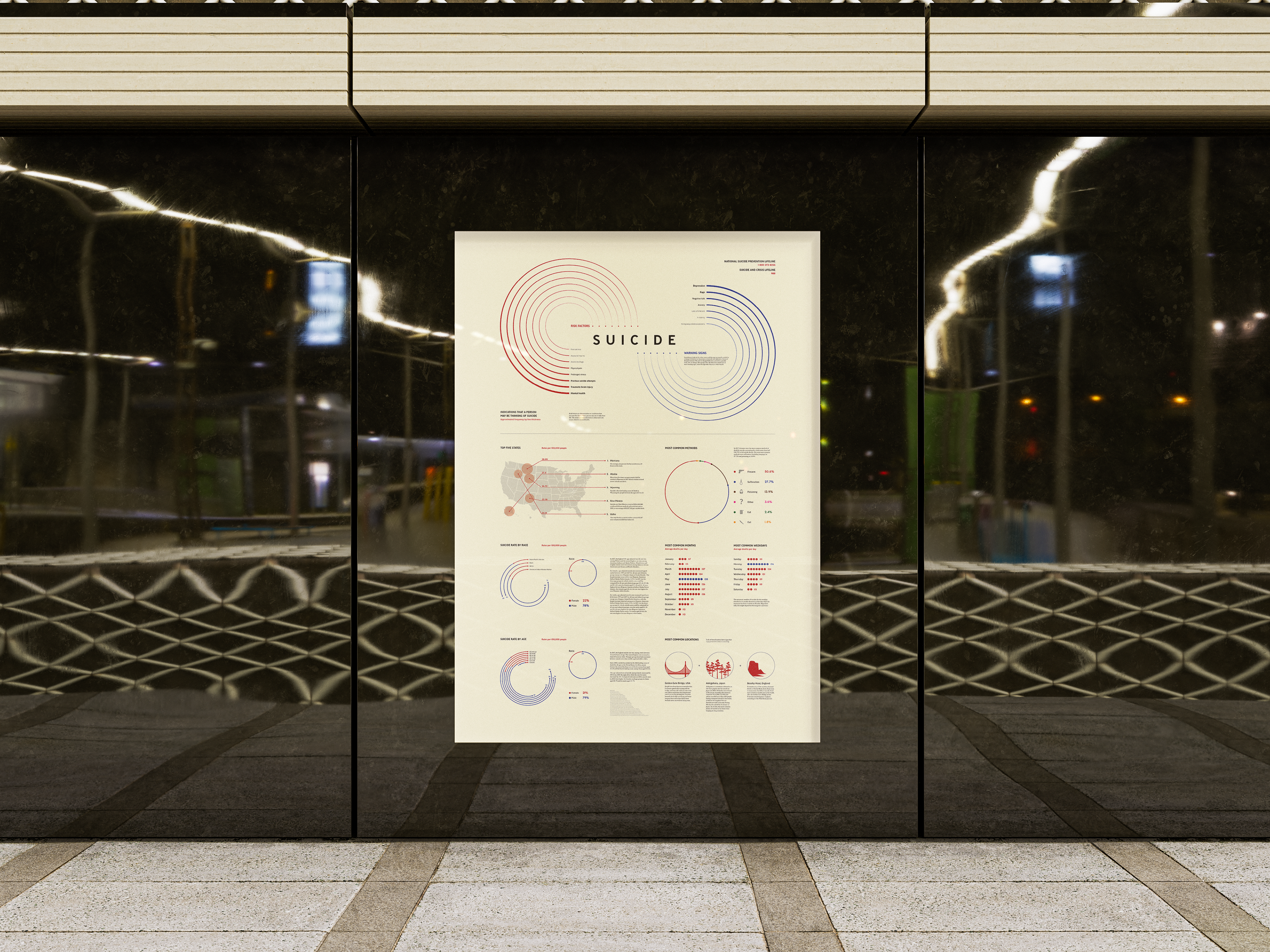
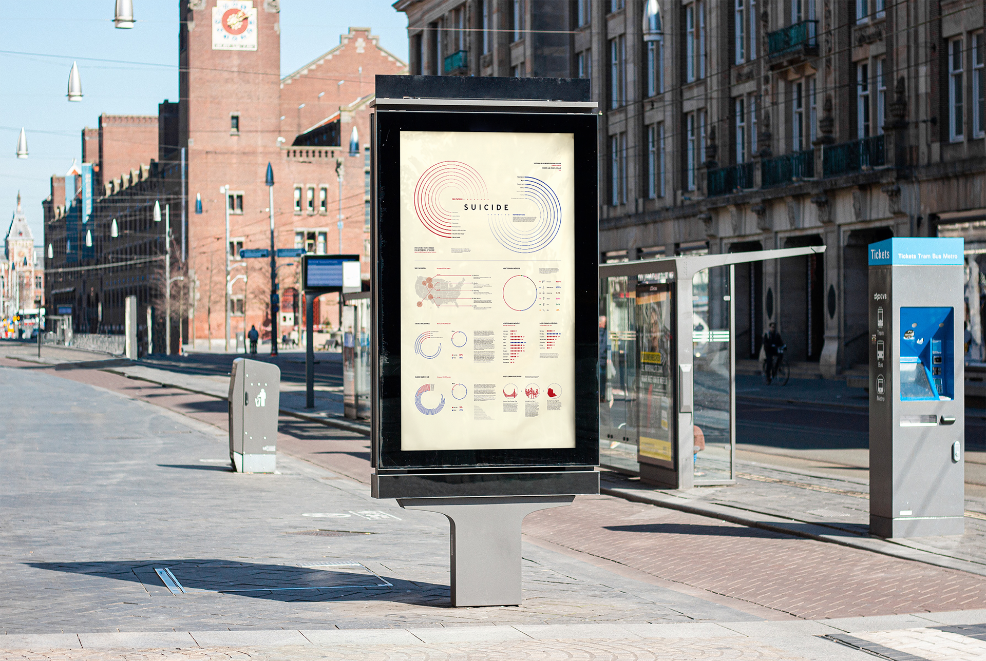
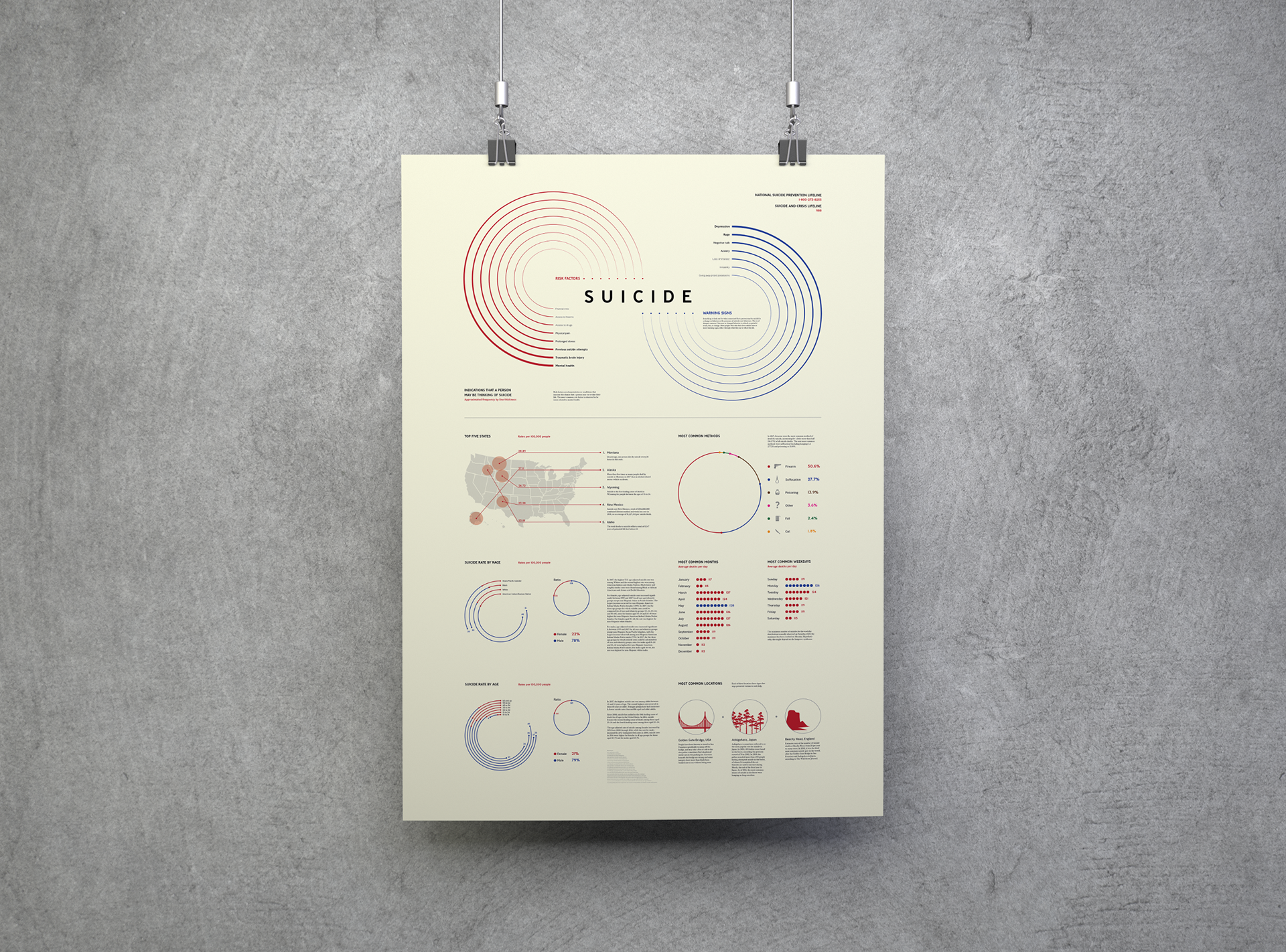
Infographic poster
Examples of the infographic being displayed as a poster in public spaces.